How to use Malivhu?
Introduction
This is a guide to help you use Malivhu from the data input step to the results page, explaining each option the tool has to offer using the demo data that is available for everyone, so that you can replicate the results. If you have any questions that are not covered in this page, send an email to david.guevara@usu.edu.
Data input
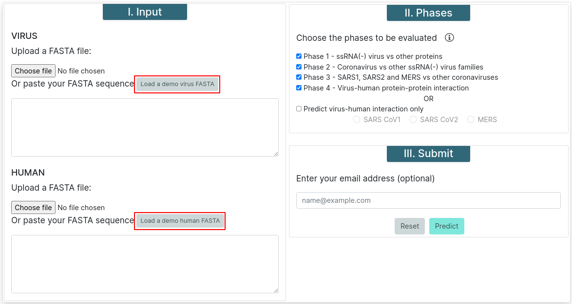
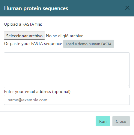
For all predictions the accepted input must be proteins in FASTA format. You can upload a file or copy and paste a text for the virus and human sequences. All sequences must be at least 31 amino acids long. You can find a button which says Load a demo virus/human FASTA, which will fill the input boxes with several protein sequences for virus and human.
Phase Selection
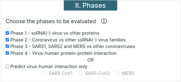
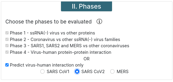
Malivhu can work in four phases or, if you know what strain do proteins come from, you can choose to skip the first 3 phases and run only phase 4. For phases 2 and 3, previous phases must be run too.
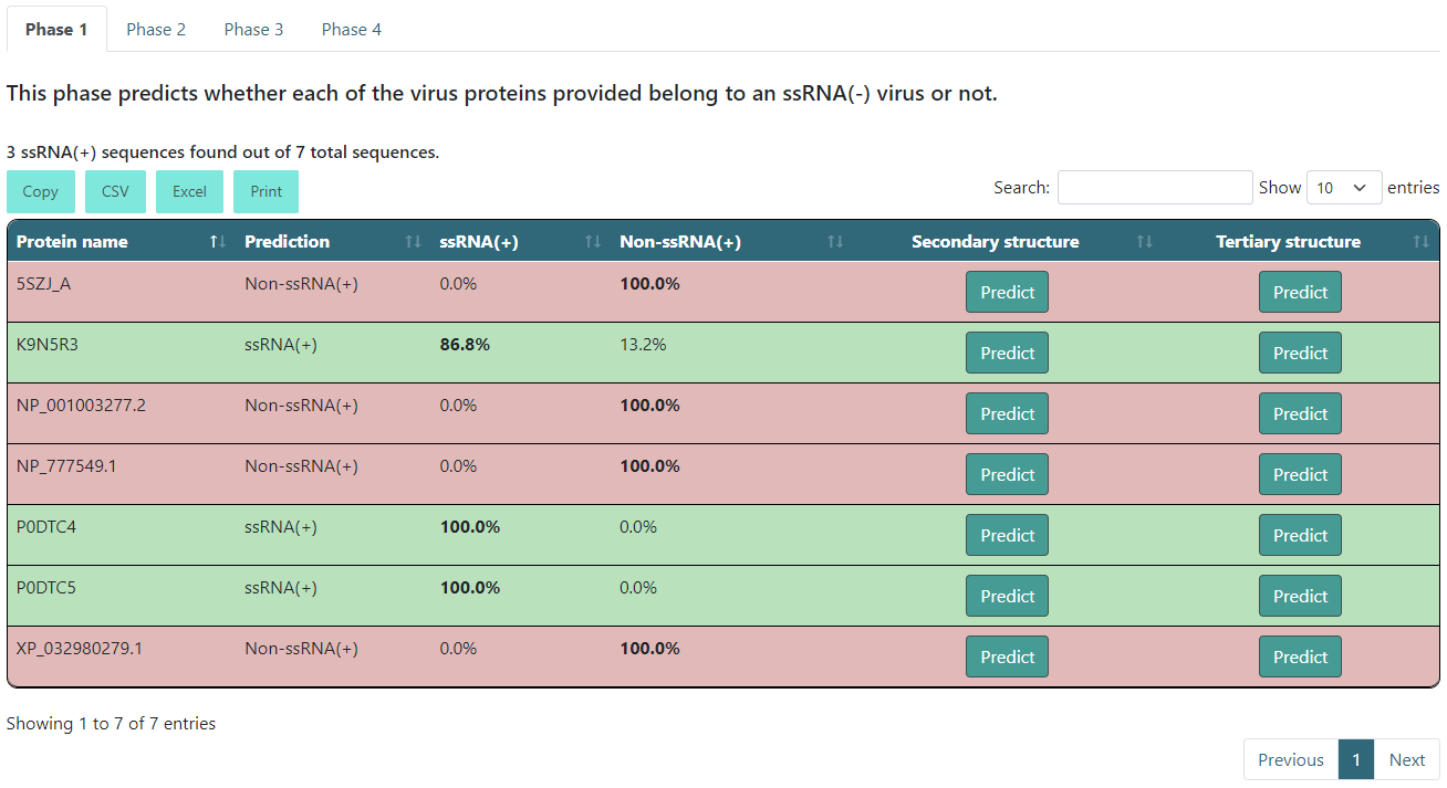
Phase 1 - This phase predicts whether the input sequence is an ssRNA(+) protein or not.
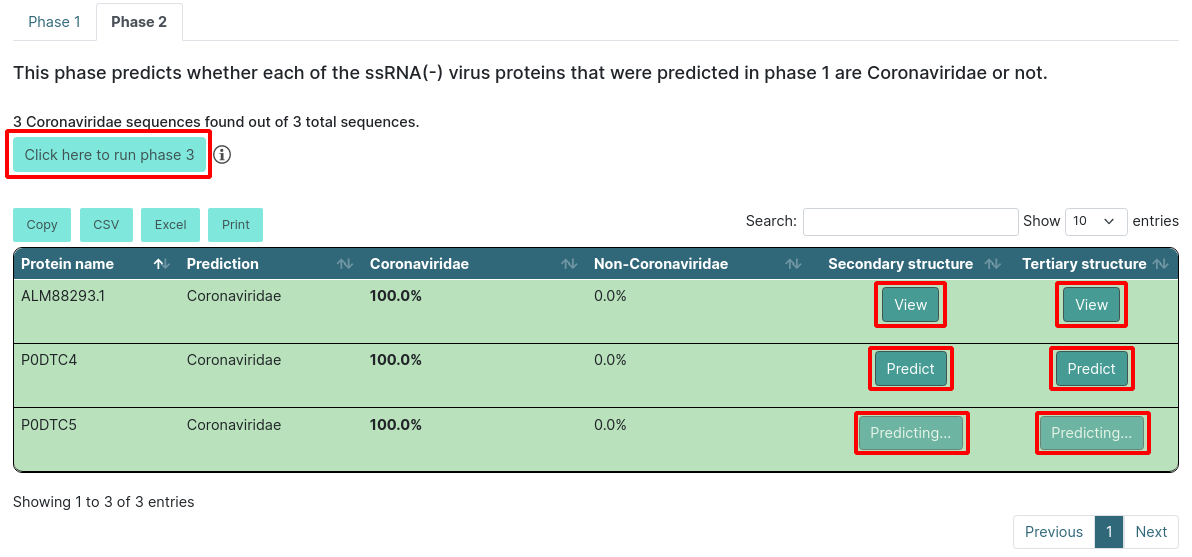
Phase 2 - This phase predicts whether the protein comes from a coronavirus or not.
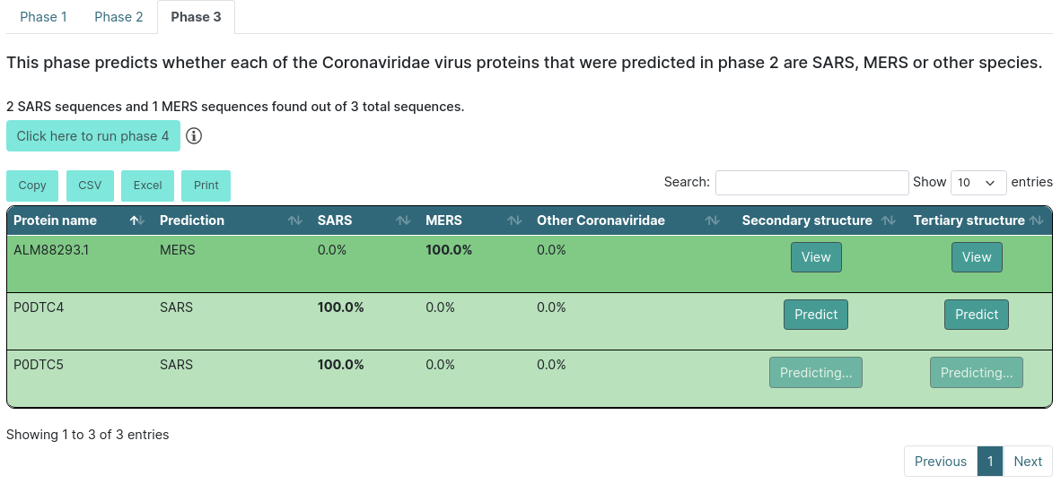
Phase 3 - This predicts whether the protein comes from MERS or SARS or other species.
Phase 4 - This phase predicts whether both proteins interact or not. If phase 3 was executed, it runs a BLAST for all SARS proteins before the prediction to find if they belong to SARS-CoV or SARS-CoV-2.
Predict virus-human interaction only - This option runs phase 4 only. You must choose a virus strain for it to be executed.
Submit
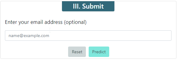
The Submit section has a text box where you can type your email, so we tell you whenever your job is done running. Below you can find a button for resetting the form and the button for submitting your job. After submitting your job, if you stay in the same page, it will redirect you to the results page whenever it is done predicting.
Results
For the following examples we submitted our jobs filling them with the "Load a demo virus/human FASTA" button. On the top you will find a tab for each one of the executed phases. The selected one will have bold text. Below the tabs you will find a short description of what the phase does.
Above the results table you will find 4 buttons for exporting the data: Copy for copying automatically the results to the clipboard in a tab-separated format; CSV for downloading a file in CSV format; Excel for downloading an Excel file with the results; and Print for printing the table.
You can use the Search text box for filtering a specific protein or specific predictions, and also you can use the Show list to increase the number of entries you want to look at on the same page.
Executing phases 1 and 2 only
After the description you will find a summary of the results. This will tell you how many sequences were ssRNA(+) if it is the phase 1 tab, and how many sequences were Coronaviridae if it is the phase 2 tab. The results table will color the entries according to their results. If it is a positive prediction (e.g. if it is an ssRNA(+) or Coronaviridae sequence), it will be green. If not, it will be red. Additionally, it will show the highest score in bold text.
There will also be a button inside each row for you to predict the protein secondary and/or tertiary structure. If you click Predict, it will start predicting and will change to a View button when it is done.
WARNING: the tertiary structure prediction might take around 2-3 hours. You can always come back to the results page and check if the prediction is finished.
When you click the View button, it will open a new tab in your browser that will have the secondary structure prediction in PSIPRED format and the tertiary structure in PDB format on NGL.
If you choose to run only up to phase 1 or 2, you will see a button above the export options that allows you to run the next phase. In our example, we ran phases 1 and 2, so we can run phase 3. It will automatically get the results for phase 3 and reload the page, showing the results.
Executing phase 3
After the description you will find a summary of the results. This will tell you how many sequences were from SARS and MERS. The results table will color the entries according to their results. If it predicts that the protein belongs to SARS, it will be light green, and if it predicts that the protein belongs to MERS, it will be dark green. If not, it will be red. Additionally, it will show the highest score in bold text.
There will also be a button inside each row for you to predict the protein secondary and/or tertiary structure. If you click Predict, it will start predicting and will change to a View button when it is done.
WARNING: the tertiary structure prediction might take around 4 hours. You can always come back to the results page and check if the prediction is finished.
When you click the View button, it will open a new tab in your browser that will have the secondary structure prediction in PSIPRED format and the tertiary structure in PDB format on NGL.
If you choose to run only up to phase 3, you will see a button above the export options that allows you to run the next phase. When that button is clicked, it will show a new form where you will be able to input human sequences with a file or a fasta text, or you can also fill it with the demo data. Here, you will find the field to input your email as well, so we alert you when it is done predicting. If you click Close, it will close the form. If you click Run, it will start the prediction, and if you stay in the same page, it will open a new tab with the results whenever the prediction is done.
Executing up to phase 4
If you chose to predict virus-human interaction only, you will only see the tab for phase 4.
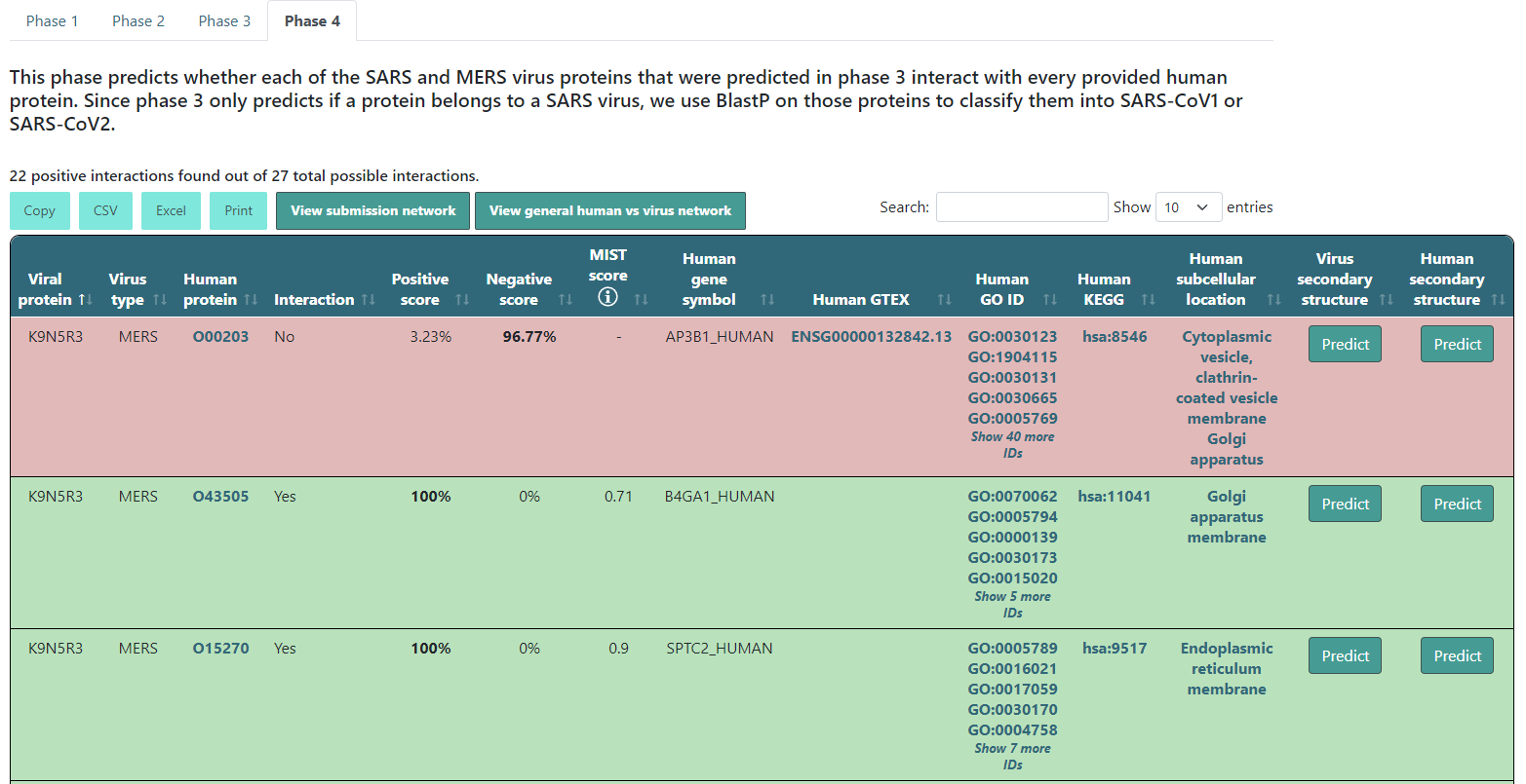
After the description you will find a summary of the results. This will tell you how many protein pairs were predicted to interact. The results table will color the entries according to their results. If it predicts that the protein pair interacts, it will be green. If not, it will be red. Additionally, it will show the highest score in bold text. If the interaction is found in our experimentally confirmed interactions database, the positive score will be 100% and a MIST score of the experiment will be displayed. This only happens when the virus and human names correspond to the UniProt IDs and gene names we have in our database.
Besides this information, if the human protein's name is a UniProt ID or a gene name, you will have some more extra information. Specifically, a click on that protein name will take you to its UniProt webpage, Also, the human gene symbol will show up with its human GO IDs, KEGG ID and their subcellular location, all of them with redirection to their respective webpages. Finally, if that human protein has an OpenTargets entry (or Gencode ID), it will appear under the Human GTEX column, and if you click it, it will open its GTEX webpage.
There will also be two button inside each row for you to predict the viral or human protein secondary structure. If you click Predict, it will start predicting and will change to a View button when it is done.
When you click the View button, it will open a new tab in your browser that will have the secondary structure prediction in PSIPRED format.
Moreover, if you click View submission network, a new tab will open where you will be able to visualize the interaction network between the predicted positive results.
In addition, if you click View general vs virus network, another tab will open where you will be able to visualize the interaction network between all input human proteins and the main proteins found in each one of the three viruses.
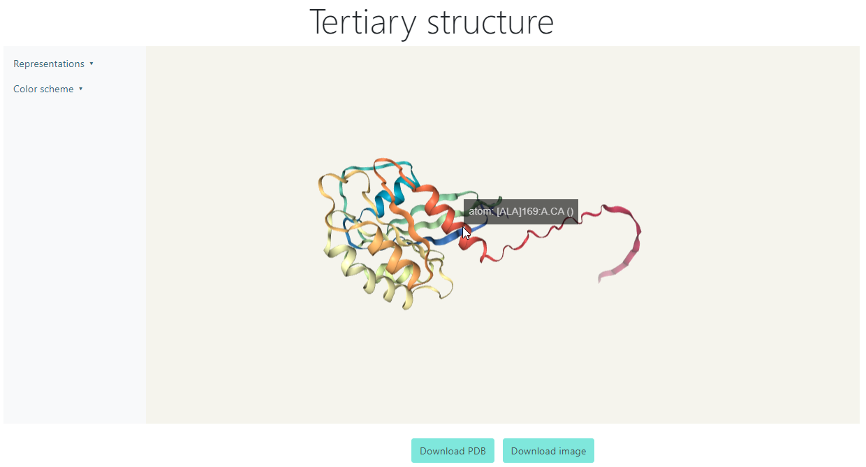
Tertiary Structure
The Tertiary Structure visualization can be accessed clicking the View button for a viral protein after it has finished predicting. For the following example, protein 5SZJ_A from the dummy data will be shown.
You can left click and drag on any blank area of the viewer to rotate the protein, or right click and drag for moving the figure to any direction. Also, for zooming in and out, you can use the mouse wheel. If you hover on any point of the structure, it will display the short name of the amino acid at that place with its ordinal number in the sequence.
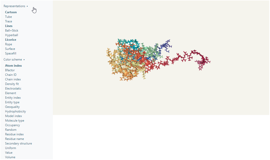
At the right there is a menu with two options: Representations and Color scheme. Within the Representations menu there are 10 options to change the representation of the protein, which can be turned on and off, which means there can be multiple representations activated at the same time. Within the Color scheme menu there are 20 preset color schemes to show the protein, and there can only be one active at a time.
Additionally, you can download the PDB file or the image of the current state of the protein with the chosen representations and color scheme.
Interaction Network
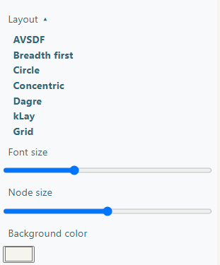
The Interaction Network section shows a graph showing the interactions between the viral and human proteins, which can be downloaded as a Cytoscape JSON or as a SVG image of what is being currently displayed.
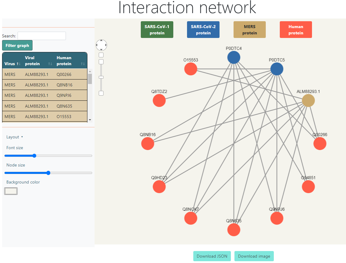
Above the graph it displays the colors for each type of node and what it means. They are also buttons that filter the graph when they are clicked, so if, for example, SARS-CoV-2 is clicked, all SARS-CoV-2 nodes will be hidden, as well as the human nodes that were left with no interactions, and it will also hide all the interactions in the table at the right side. If it is clicked again, the removed nodes will show up again. The only button that is not clickable is the Human protein legend, since deactivating the human proteins would hide everything.
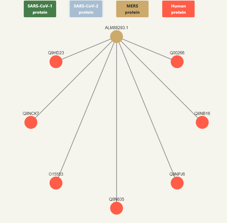
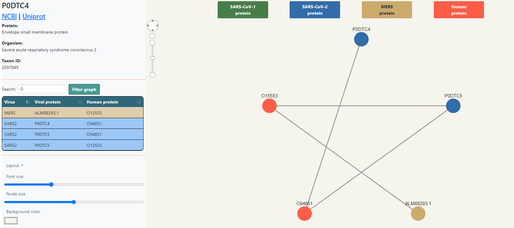
All nodes are clickable and can be dragged and dropped wherever you want inside the box. If a node is clicked, it will show additional information in the upper right side that Malivhu found about the protein based on the name it had in the FASTA sequence by searching on NCBI and Uniprot. It will show the links to the NCBI and Uniprot pages, along with the full protein name, the organism it belongs to and its taxon ID. Every piece of information will show up depending on whether data about it was found or not.
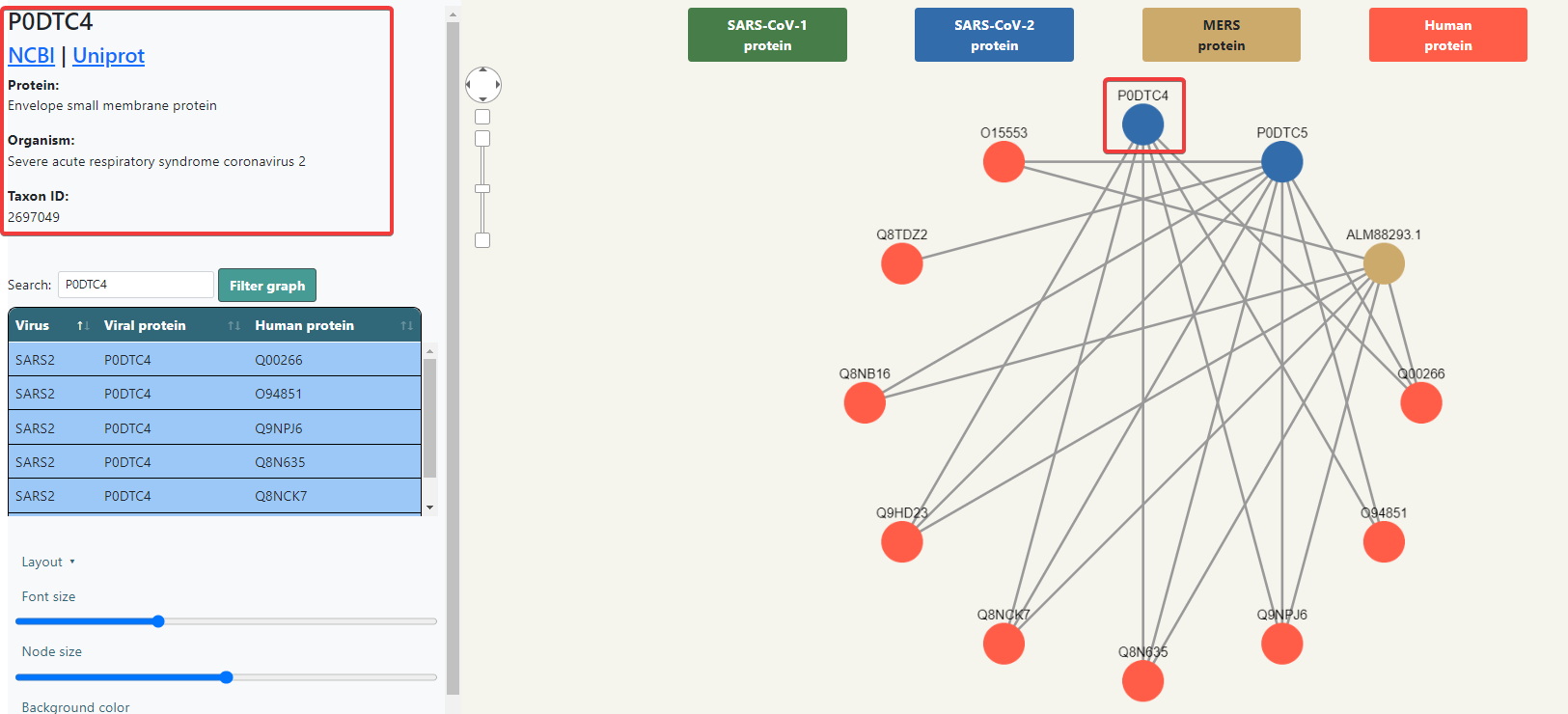
Below the protein information (or at the top of the right panel if no node has been selected) you will find a table with the list of interactions, listing the virus, the viral protein and the human protein, each row colored depending on the virus. Above the table there is a search bar that will automatically filter the data depending on what is typed. Clicking the Filter graph button will not only filter the table, but also the graph.
In the bottom side of the right panel there are visualization options. You can choose a layout, which changes the shape of the displayed graph, the font size of the nodes, the node size and the background color of the box. All these changes will be shown when downloading the SVG image.